Category

Blog

Hootsuite takes the low road, blames complaints on “fear of change”

By Blog

I’ve been watching the reaction to Hootsuite’s new social picker with interest. Many power users say it slows them down, and makes their jobs harder. Hootsuite’s official support account has chirpily thanked users for the complaints, but have offered no solution. Maybe that’s because Hootsuite believes users are the problem, rather than its software design choices. Check out this exchange with one user:
hootsuite_2013
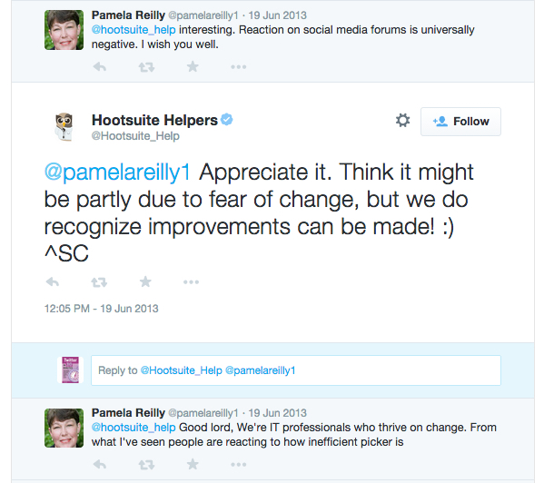
Pamela’s response is absolutely correct. I would go a step further and say that Hootsuite’s comment is utterly patronizing. The “fear of change” excuse is something you see trotted out by organizations or management that believe customers are old, stupid, ignorant, and stubborn. It’s often associated with denial that the program or plan itself has faults, and/or hasn’t been communicated well.

Many of the complainers are paying power users who have have explained exactly what’s wrong with the new social picker (slows them down, inefficient, more steps involved, etc.). We have been through many other user interface changes in the past without quaking in our boots or complaining through clenched dentures. I’ve been using Hootsuite for more than 3 years and have been happy with the UX improvements … until now.

So, Hootsuite community managers (or CEO Ryan Holmes), if you happen to read this post:  Please don’t talk down to your customers. Listen to what they have to say, and evaluate it seriously. If not, you’re going to start to find that some of us will dump Hootsuite Pro accounts for tools that offer better functionality — without the attitude.

Hootsuite’s new social picker sucks

By Blog

(Updates at bottom of post) Hootsuite has a new social picker. This is the function that lets users choose which social networks they want to use for a particular message. As a power user, this is a very important feature — I use Hootsuite for general tweets, posts to LinkedIn or Facebook pages, and general promotion of In 30 Minutes guides and other interests. The social picker used to look like this:

Hootsuite's old social picker

Twitter accounts, Facebook pages, and all other social networks that you had hooked up to Hootsuite were visible by default. You could select or deselect at will.

Last week, they changed it to this:

hootsuite_new

What happened?

Social networks are now hidden in a drop-down menu on the right side of the picker. This makes it far more difficult to select and deselect specific social media accounts — users have to first click the drop-down menu, then select the accounts. For people with lots of accounts, there is scrolling involved.

Why change a user interface element that’s not broken? I asked @hootsuite_help, and got this reply:

“Pinning” social networks means setting them up as default choices for Hootsuite. If you click through to their help link, you’ll see that the process is non-intuitive. In Web UX design, “pins” are usually associated with geographic locations, not social networks. I don’t think many users will be able to figure out how to set the defaults on their own, which will lead to lots of frustration.

In addition, Hootsuite power users typically have lots of social network accounts (I have more than 15) and multiple use cases. Default accounts simply don’t work if you are constantly switching between clients, accounts and campaigns.

The new social picker is a step in the wrong direction. This interface tweak delivers no value to me, and in fact makes it much more difficult to use the tool — I either have to constantly click and scroll to select networks, or deselect the defaults. I’ve already found that I’m using my social networks less as a result

One other thing to add: I pay for Hootsuite. The company never told me about the change, or asked for my feedback. This is a bad way to treat customers, and I predict some will fly the coop — I am definitely considering other options.

How are other people reacting? I saw one positive tweet from someone who said she uses the same social network accounts 99% of the time and likes having default accounts. However, most of the other Hootsuite users out there who have publicly commented are clearly frustrated with the new social picker:

What do you think of Hootsuite’s new social picker? Leave comments below.

Update 1: Go to the Hootsuite feedback forum and let them know you want to revert to the old social picker.

Update 2Hootsuite takes the low road, blames complaints on “fear of change”

The new Gmail for Android interface sucks, and I blame Google+

By Blog

(Update: There is a way to get rid of the letters – see note at bottom of post) Yesterday, Gmail for Android automatically updated on my LG Optimus. When I opened up the Gmail app later in the day, this is what I saw:

New Gmail app for Android interface

What’s up with the alphabet soup? These giant letters mean nothing — they are simply the first letter in the “from” field, like “B” for Bowker or “M” for “McCarter”.

If they deliver no value, then why are the giant letters hogging up so much screen space? I believe it’s because of Google’s zeal to force its lagging social network Google+ on everyone — and its doesn’t have a good way to handle people or entities that don’t belong to the network.

It’s not necessary to explain what Google+ is, or how it works. Just know these two things:

  1. Outside of a few niche audiences (such as tech pundits and photo buffs) Google Plus has failed to achieve mainstream adoption (Danny Sullivan, May 17: “Nearly two years after its launch, Google is still dealing with people who question why they should bother with Google+”). Google has been doing everything it can to change that, by forcing Google Plus features and identities into its more popular products, such as search, Gmail, YouTube, and Blogger.
  2. Important elements of Google Plus are the accounts associated with people who use the service. Two pieces of information that are a key part of each Google+ account are the email address and user-selected profile photo.

You’ll notice that a few of the emails in my inbox have photos or icons instead of letters. What apparently is going on is Gmail looks at the email addresses of messages, and if a certain address is associated with a Google+ account, it will display the photo or icon associated with that account.

What if the email address is not associated with a Google+ account? I can imagine the brilliant Google designers and engineers in their air conditioned offices in Silicon Valley looking uncomfortably around the table (or in their standup meeting) pondering that question. Because there is no good answer, and backing away from Google+ is not an option, they threw up their hands and decided to go with gigantic letters.

I have a few problems with this approach, besides the fact that the letters contain no useful information:

  1. They are distracting.
  2. They take up too much screen real estate on an already small screen
  3. I am not sure of this, but I believe I am seeing fewer emails in the inbox because the letters are so big and the space between the messages seems to be larger. This forces scrolling, which takes up more time and more battery life.
  4. Because most people and organizations don’t have Google+ accounts, the letters will continue to dominate my inbox.

I’m not the only one who has problems. Via Twitter, a small sampling of the negative comments about the new Gmail interface on Android:


Besides the giant letters, there are also complaints about the easy batch delete option disappearing (swiping individual messages to the right will archive them, but it looks like deletions require opening the message). I also wonder what it’s like for people who aren’t heavily into tech or social apps. What do they think when giant letters clutter up their inbox, with a few random faces here and there?

What do you think of the new Gmail for Android update?

Update: There is a way to get rid of the letters and faces. Go to Settings>General Settings and uncheck “Sender Image”. Unfortunately, other elements of the new Gmail for Android UI — such as the two-step delete process — do not have a fix.

Are barcodes necessary for self-published books?

By Blog, Industry

Are barcodes necessary for self-published books?Are barcodes necessary for self-published books? The answer for authors who are using ebook services such as Amazon KDP, iTunes Connect, and Nook Press, is “no“. If you have an ebook cover for your book, there is no need to place a barcode on it. Barcodes are only intended for people who sell paperback or hardcover books, so the people at the checkout counter or distribution center can scan them.

Even if you use a service like CreateSpace or Lightning Source to print your books, you still don’t need to purchase barcodes. Both companies will provide a barcode for free (based on the ISBN you use) and apply it to the rear cover during the production process. Note that your cover designer may need to create a small white rectangular box for the barcode to appear in.

When barcodes are necessary for self-published books

Now, if you are planning to do a large print run through an offset printer and ship the lot to Barnes & Noble, then yes, you will need to apply a barcode to the back of every book. But frankly, if you are selling enough books to do consider a large run, you probably should have a publisher or professional printing firm handle those details, rather than taking the DIY route.

If you do want to try the DIY route, I use this free book barcode generator based on an ISBN I supply. It’s how I created the inset barcode for our popular book that explains what is C. diff. My designer vertically truncates it to fit the small space on the back of my book.

Bottom line: You probably don’t need to pay for barcodes. Don’t purchase one from Bowker, which exploits new authors with overpriced and often unnecessary services. If you plan a professional printing run in order to distribute books through a retailer, you will need to add barcodes … but it’s possible to get them for little or no money. Talk with an experienced book cover designer who should also be able to help you generate and place a barcode on the back of your books.

A guide for people who don’t get LinkedIn

By Blog

A few months ago, an entrepreneur confided to me that he didn’t “get” LinkedIn. Yes, he had a profile (basically a copy of his résumé) and the beginnings of a network. But he didn’t know what he was supposed to do with it, or how LinkedIn could help him. I was surprised, because he has the largest Rolodex I’ve ever seen — more than 4,000 contacts.

It turned out that he wasn’t the only one. I asked around and discovered that many of my real-world friends and colleagues either didn’t have a profile, or just filled in the basics and left it dead in the water. Like the entrepreneur, they had hundreds or even thousands of career contacts in the real world, but hadn’t made the jump to online career networking. “What’s the point?” they asked. “How can it benefit me?”

LinkedIn User GuideIf you’re nodding your head as you read this, then you need to get LinkedIn In 30 Minutes, by author Melanie Pinola. It’s a LinkedIn user guide that targets people who are new to the career networking service, as well as people who have rudimentary profiles in need of a serious makeover. It not only explains why LinkedIn is so important, it also shows how to use it, using examples, screenshots, and step-by-step explanations delivered in plain English. LinkedIn In 30 Minutes is available for purchase in a half-dozen formats, including paperback, a Kindle edition, the iPad version, and even a PDF. The official product website also contains some basic resources for people new to LinkedIn (“What is LinkedIn?“) and a growing library of bonus resources about LinkedIn.

The author, Melanie Pinola, knows her stuff. Not only has she written about LinkedIn for Lifehacker, she has also experienced LinkedIn as many people do — she started with a basic profile, but didn’t really appreciate the value of the career network at first. She describes her early experience in Chapter 4:

I have a confession to make. Once upon a time, I was a lackluster LinkedIn member. My profile was basically a duplicate of my résumé. I rarely interacted with other members. I didn’t join any groups.

In other words, I was like many people who are “on” LinkedIn but not seriously using it because the site is seen as more of a job-searching tool.

After learning about all the ways LinkedIn can help professionals in all stages of their careers, I wish I had been using LinkedIn more effectively from the very beginning.

For one thing, just having an updated profile and being active on the network makes you a more attractive employee or career professional. It’s like wearing a badge that says “Yes, I care about my career and what I do (and I’m poachable!).”

Also, I think we’ve all realized by now that no job lasts forever. It’s better to be ahead of the curve by being active on LinkedIn and cultivating relationships before you need it to find a job.

There’s more. LinkedIn is also a gold mine of information about people, companies, and industries. It’s growing increasingly more valuable as a career enhancer, with more tools and features being regularly added to the network.

Melanie’s insights deliver huge value to anyone getting started with LinkedIn. For a small investment of time and money (it costs less than a pizza!), LinkedIn In 30 Minutes will help you create a rock-solid online career presence. Check out the contents of the guide here, and then buy it here. You won’t regret it.