Tag

UX

Lean media and books: Which cover works for you?

By Blog

When it comes to Lean Media and books, there are a few approaches for creators to tap test audiences for insights.

One involves the use of beta readers. As recounted in On Writing and elsewhere, author Stephen King turns to a small group of beta readers (including his wife and “ideal reader,” the novelist Tabitha King) and listens very carefully to what they have to say:

In addition to Tabby’s first read, I usually send manuscripts to between four and eight other people who have critiqued my stories over the years.

If more than one of them brings up something that doesn’t quite work, such as a plot twist or a piece of dialogue, he is apt to change or even remove it in the next revision. I think this is a very effective way to catch potential problems before they make it into print, and also to create a work that is more likely to click with readers.

Another approach involves cover design. At IBPA’s Publishing University conference in 2015, I saw how several New York publishing houses use focus groups and A/B testing to generate actionable metrics that they can use to decide which cover design or design elements will resonate the most with readers post-launch.

But you don’t need to be a big publishing house to do this type of test. Right now, I would like you to take a look at the following test covers for Genealogy Basics In 30 Minutes, which will be released later this year. Which cover works for you? Leave your choice in the comments, as well as any other feedback that you think may be helpful!

Genealogy Basics book by Shannon Combs-Bennett

Turn off Twitter notifications on your phone (with screenshots)

By Blog

One of the top complaints we hear from readers of In 30 Minutes guides concerns social media notifications. The networks want to do everything they can to get people coming back, so new accounts are mercilessly bombarded with friend requests, recommended accounts to follow, promotions, and much more. Twitter is particularly bad when it comes to notifications because there are so many possibilities that aren’t seen in other networks, such as retweets and being added to a list. In addition, so much Twitter activity takes place on phones, that the notifications can be a serious distraction. This post will show how to deal with Twitter notifications on a phone (specifically, an iPhone 6), as well as email notifications, which also show up on phones. For more information about how to manage your Twitter experience, check out Twitter In 30 Minutes).

While the phone’s master settings can be used to shut down all notifications (for instance, in iOS 9 go to Settings > Notifications and scroll down to the Twitter app to turn off banners, lock screen notifications, etc.) chances are you may want to receive some notifications while disabling others. Here’s how:

1. Open the Twitter app, and click on the profile icon. Then, click on the gear icon to access settings:
Twitter mobile app iphone settings

2. The general settings screen is very basic. To get to the notifications, tap the account name (for instance, @in30minutes):

Twitter mobile app settings

3. Then tap “Mobile notifications” for that account.

4. Finally, you will see the notifications toggles:

Twitter mobile app notifications settings

If you no longer want to receive a certain type of notification on your phone, toggle it off. For instance, to stop receiving “new follower” alerts, toggle the New Followers settings to the left so it is greyed out. There is no “Save” button; the changes simply take effect right away.

It’s important to note that this method won’t control every type of Twitter notification; for instance, if you are receiving Twitter notifications via email (most people do receive notifications via email as well) these will be forwarded to your inbox, which may also show up as mobile notifications on your phone. Twitter email notifications have to be handled separately, as the following video describes:

99 Designs review: Crowdsourcing a book cover redesign

By Blog

Book cover redesign is a big deal. It takes time, there are lots of hassles, and at the end of the day it requires authors and publishers to step out of their text-based comfort zones and make hard choices about visuals. I’ve participated in several book cover redesigns, as well as redesigns of magazines, newspapers, websites, and mobile apps, always working with designated design teams and traditional workflows. However, for the book cover redesign for In 30 Minutes guides, I decided to take a different approach using crowdsourcing at several key stages. This post will serve as a description of the process as well as a 99 Designs review.

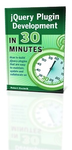
First, a little background about the redesign project. I launched In 30 Minutes guides in 2012, first with a DIY design just to test the concept (using a fast prototyping and testing approach I call “lean media”). Once I verified that readers liked the basic brand, I enlisted a graphic designer I had worked with before to create something more attention-grabbing and professional for the book covers. It was important to have a consistent design for the series, and have something that could stand out in Amazon and other online marketplaces. Here’s what we eventually came up with:

Old design for In 30 Minutes guides

The original book cover designs dating from 2012

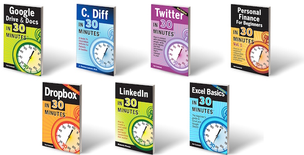
This design has served us well, and enabled Google Drive & Docs In 30 Minutes, LinkedIn In 30 Minutes, and several other titles to sell many thousands of copies in both ebook and print editions. However, this year I decided it was time for a new design. There are three reasons for this:

  1. I am preparing for national retail distribution for the paperback edition, and several other publishers as well as people working for distributors have suggested that I try a more modern design. Retro works for retro topics, but for technology and and current business trends, something more modern is appropriate.
  2. After 3 years with the same designs, I felt we should at least have a refresh (a light redesign that preserves the core feel of the existing design, usually with more modern elements). When I worked on magazines and online publications, refreshes or full redesigns typically happened every 3 years.
  3. The old design doesn’t leave enough room for subtitles

For the new redesign, I decided to take a different approach. I feared putting all of my eggs in one basket with a new graphic designer (especially someone I have never worked with) might limit my options and take a long time to work through. I also wanted to see if any online services could work faster and more cheaply. I had used oDesk (now Upwork) in the past for small design projects, and had pretty good results for a relatively low cost.

I soon stumbled upon 99designs. This is a design company that is using crowdsourcing and a global pool of design talent to provide services. The basic idea behind a 99designs “contest” is the client pays a set fee ($300, $500, $800, etc.) for dozens of freelance designers to come up with different design ideas and eventually come up with a winning design. The graphic designer whose design is chosen by the client wins the prize.

The concept is not without controversy, and many experienced designers don’t participate — it goes against their beliefs about the client/designer relationship, the prize doesn’t come close to their standard rates, and there’s a real chance they may not win. But it opens some doors for younger designers, as well as designers from other countries who otherwise would have a tough time recruiting clients outside of their regions.

I liked it because it gives me the chance to see ideas from lots of different designers, and moves fast — the contest can wrap up in about a week. So I decided to give it a shot.

I chose 99 Designs’s “silver” level ($500) which supposedly attracts more experienced designers and results in more submissions. I also paid a little extra to make my contest stand out ($19) and required participants to sign an NDA (I think about $39, but in retrospect that may not have been necessary considering I am blogging about it now!) It’s basically a form of crowdsourcing, although some people might view it as more of an auction (historical note: one of the first crowdsourcing experiments took place at a British cattle auction, when participants were asked to guess the weight of cow — the average guess was just one pound off the correct weight).

99 Designs review: submitting redesign specifications

Here are the specs I submitted via the 99 Designs website:

Describe what your organization or product does and its target audience

I am the publisher of In 30 Minutes guides — how-to guides for technology, business, and other mildly complex topics. Our current selection can be seen on in30minutes.com.

Our motto is “Quick guides for a complex world.” Our target audience generally skews to 40+, male and female, but we sometimes get younger readers. Most are in the U.S., U.K., and Canada.

Describe what you want designed

I need a new cover design template for the series.

The current designs date from 2012 and have served us well, but feedback from professionals in the book industry state the design is “too retro.” There are a few other issues with the template we use, such as not enough space for the subtitle. I have attached samples.

The deliverables for this project include:
* Two sample ebook covers for two titles (RGB PNG) (LinkedIn In 30 Minutes and Excel Basics In 30 Minutes, 2nd Edition)
* One sample print cover including spine and back cover (RGB PDF) (LinkedIn In 30 Minutes)
* Template master (PSD, etc.)
* All art elements, fonts, etc.

Specs:
* 6” wide by 9” tall (paperback). Spines have two versions — .23” and .21” — with the title of the book and the publisher (i30 Media). Paperback needs to have white box on rear cover (see sample) for ISBN placement. See https://www.createspace.com/Help/Book/Artwork.do to download a template (use black and white interior, 6”x9” trim size, 102 pages, white paper)
* Ebook: 1600px wide 2560px high (front cover only, note that it is identical to the print cover) (see https://kdp.amazon.com/help?topicId=A2J0TRG6OPX0VM#dim for more details)

The new design needs to:
* Look more modern, clean — more “Apple” than “Microsoft”
* The new design does not need to echo the old design — something completely fresh is fine!
* Incorporates the “In 30 Minutes” concept in some way (for instance, in the old design we used a stopwatch)
* Flexible to handle long titles and subtitles (for instance: “Dropbox In 30 Minutes” vs. “Personal Finance For Beginners In 30 Minutes, Vol. 1”)
* Easy to read title and stands out even when shrunk to thumbnail size on Amazon or other online/mobile marketplaces. This is very important.
* Even though the guides sometimes talk about products, we will not be using product photos or logos on the cover.
* It has to be clear different guides about different topics belong to the same series.
* Colors can be uniform, or differ from guide to guide, but please do not use any combination of yellow and black.
* The back cover of the print version needs to have our motto “Quick guides for a complex world” appear somewhere, set off from the rest of the text.

Is there anything else you would like to communicate to the designers?

The following examples of book series can be shared:

500 series: http://amzn.to/1EtyA7k
Gualtieri series: http://www.kboards.com/index.php/topic,214196.0.html
http://amzn.to/1KXEWR2

I am including them because they clearly belong to the same series, and also show up well as thumbnails.

“Please do not use any combination of yellow and black” relates to the fact that many casual observers mistakenly equate In 30 Minutes guides with “For Dummies” books. The concept is actually quite different on several levels, including the facts that our guides are much shorter and easier to read and cover topics that Dummies guides don’t (Google Drive, Dropbox, etc.). But I want to avoid any suggestion that In 30 Minutes guides are attempting to mimic Dummies — so no yellow/black designs!

Judging the book cover redesigns

The 99 Designs contest started. Soon I began to get designs from people all over the world. Logging onto the 99designs.com website, I was able to perform the following tasks:

  • Communicate with designers by leaving private comments and “stars” on specific designs
  • Eliminate designs I did not like
  • Use a special tool to mark parts of a design and offer suggestions (“move the stopwatch hand to the 5:30 position”)
  • Add files, such as graphic elements or samples.

Many of the designers responded very quickly. One early problem related to conveying the “In 30 Minutes” concept visually. Digital timers don’t really work, as they could be other things (such as a thermostat or gauge). The traditional stopwatch was the only real choice, but I had to tell designers not to use “free” clip art or vectors from the Internet, as many of them actually come with copyright or usage restrictions. I ended up licensing a few shutterstock vectors of modern-looking stopwatches and uploaded them to 99designs.

Here are some of the early designs:

99 designs review - crowdsourcing book cover design using 99 designs

99 Designs review: Some of the designs submitted during the early part of the contest

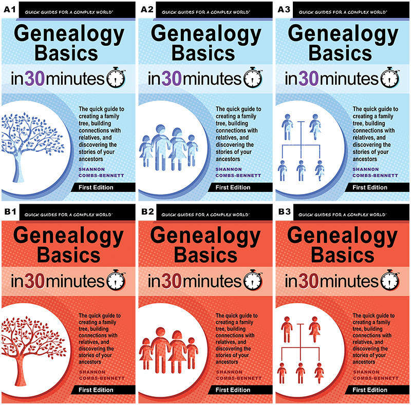
The first phase of the contest ended after 5 or 6 days. I was then prompted to choose the six finalists, but was also offered an option to take 3 more days to have my friends and social contacts vote on the ones they liked. This is another crowdsourcing element which I happily leveraged. I used 99designs to post the contest to Facebook and Twitter, and am also leaving it open to the readers of this blog (click this link to get started, it will take less than a minute).

I liked the ability to get lots of different design perspectives from graphic artists in many countries. I also liked tools that let me easily share the results with my readers and fans, so I could get real perspectives about which designs worked and which did not.

Professional design we ended up using for LinkedIn In 30 MinutesUltimately I did not use the materials from 99 Designs contest. I had some contacts in the publishing industry review the designs, and they indicated they were not up to snuff. I don’t fault the designers for this as I was the person calling the shots in terms of what worked and what didn’t. Some of the blame for “not up to snuff” falls on me.

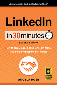
I ended up going with a design team based in Austin which I found through the Independent Book Publishers Association network. It was more expensive, but I am very happy with the results. I’ve included an inset sample here.

What did you think of this 99 Designs review? Would you ever consider using a crowdsourced design service such as 99 Designs, or would you rather go with a dedicated professional designer?

Dwolla review: Why I love Dwolla, and why I don’t use it more often (UPDATED)

By Blog

(Update: I can no longer recommend Dwolla. Explanation below). I recently received an email from Dwolla, the online payment service. It prompted me to think about why I use the service, and what’s prevented me from using it more often. This post will serve as a brief Dwolla review, and I will also look at some of the problems that Dwolla has regarding its mainstream profile.

Back to the message I received from Dwolla. It was from the community manager. The message read:

My name is Dan and I am a Community Builder here at Dwolla. I see you signed up for a Dwolla account a few months ago. Not only are you signed up but it appears you have a fully verified account with an attached funding source. The hard part is out of the way!

The reason I am reaching out is because despite your account being ready to use, there has been little activity. What are the barriers in preventing usage and what can I do to help you overcome these obstacles? It may be that we need a product that does not yet exist or maybe there is a solution you were not aware of so any type of feedback is much appreciated!

Even though I use Dwolla infrequently, I love the service. It’s everything that PayPal isn’t — easy to use, free cheap (just 25 cents per inbound transaction), and instantly sends money to some of the freelancers and vendors I work with. It even has a nice little feature that lets the sender assume the transaction cost.

Dwolla review: Why Dwolla turns off some potential users

But for many of the people I work with, to use the Dwolla send money feature is not such a slam-dunk. It’s an unfamiliar service with a funny name and an onboarding process that’s not quite ready for many mainstream users. Even though I encourage freelance editors and authors of In 30 Minutes guides to accept payment via Dwolla, almost no one takes me up on it. Some try, but the responses indicate frustration. Here’s one example:

Still can’t set up the Dwolla thing; it never lets me authenticate the account after it sends me the code, so still doing it the old-fashioned check way.

Another person told me in their review of the Dwolla service:

Dwolla is still lost to me

The most interesting response came from an editor who immediately made the Dwolla vs. PayPal connection. I sent him an invitation to join up via Dwolla. His first reaction? It could be a scam. He responded by forwarding the Dwolla email to my business email account and writing this:

I’m not 100% sure if this is a real email from Ian, or spam, so I write with caution. … I don’t use Paypal very often- an occasional online purchase or accepting payment for something.  AS far as I know the only fees for Paypal occur if I were to sell something. Otherwise it’s free.

I went to Dwolla and see they charge 25 cents for ANYTHING over $10. For example, if you were to send me $100 via Dwolla, it would cost me 25 cents. Sending $100 via Paypal is free for both of us. Am I missing something?

The editor was referring to the “PayPal is free” myth. While it costs nothing to send money to friends via PayPal, there is a significant charge for businesses who use PayPal. I responded:

No, Paypal is not free if you are a business. They charge about 3% for me to send money, for the type of account I have. I am registered as a business and trying to do things by the book.

I’d be happy to pay an extra 25 cents to cover the cost of Dwolla fees. It’s just as quick as Paypal for both of us, and it’s cheaper than sending a check (postage plus extra time required). Let me know if Dwolla is OK. Otherwise I will send the check.

The editor took a look, but came back with this:

I checked out Dwolla, and I have to say, it concerns me. Admittedly, I’m hesitant with new technology but I’ve seen a bunch of nightmare reviews for Dwolla. It took me a while to trust Paypal, and I don’t use it often.

At that point I realized it was pointless to push the issue. Trust is vitally important to any sort of online payment service or merchant, and Dwolla hadn’t earned his trust. I’ve never had any problems with Dwolla security and I do trust the service, but I wasn’t going to push it with him. I ended up writing a check.

The path forward for Dwolla

Here are the conclusions of my Dwolla review:

The Dwolla payment service clearly needs to do some work to get mainstream users on board. I think its unfamiliarity and weird name are liabilities. There are also some processes (namely account verification) that aren’t working for some people. My suggestions for Dwolla:

  • Offer some sort of guarantee for new users or certain types of payments.
  • Have a different user experience for mainstream audiences that addresses their worries and smooths out the speedbumps to getting set up.
  • The name “Dwolla” may work for the hipster/early adopter crowd, but for mainstream users it’s a warning sign that suggests flash-in-the-pan startup. If the name can’t be changed, adding a partnership with a trusted name in banking or security (“Secured by XYZ”) could go a long way toward reassuring this population.

On the last point, Dwolla does have a partnership with something called the Veridian Credit Union. They even place a message about it right on the home page of Dwolla.com (see screenshot, below). But the problem is most people have never heard of Veridian, either. That becomes another liability for the company — an unknown startup backed by an unfamiliar credit union that could be tiny or scammy or whatever. Here’s the message about Veridian from Dwolla:

Dwolla review - what is the credit union Veridian

I welcome comments about Dwolla or your own Dwolla review below.

May 2016 Update: Looks like my freelancers were right for being cautious about Dwolla. The Consumer Financial Protection Bureau claims that Dwolla lied about security:

From December 2010 until 2014, Dwolla claimed to protect consumer data from unauthorized access with “safe” and “secure” transactions. On its website and in communications with consumers, Dwolla claimed its data security practices exceeded industry standards and were Payment Card Industry Data Security Standard compliant. They claimed also that they encrypted all sensitive personal information and that its mobile applications were safe and secure.

But rather than setting “a new precedent for the payments industry” as asserted, Dwolla’s data security practices in fact fell far short of its claims. Such deception about security and security practices is illegal. Specifically, the CFPB found, among other issues, that Dwolla misrepresented its data-security practices by:

  • Falsely claiming its data security practices “exceed” or “surpass” industry security standards: Contrary to its claims, Dwolla failed to employ reasonable and appropriate measures to protect data obtained from consumers from unauthorized access.
  • Falsely claiming its “information is securely encrypted and stored”: Dwolla did not encrypt some sensitive consumer personal information, and released applications to the public before testing whether they were secure.

November 2016 Update: Talk about leaving people in the lurch. Dwolla is shutting down person-to-person payments and removing the Dwolla app from the app store. They made this announcement on a Friday afternoon just after a major election, a classic time to release bad news in order to evade media coverage. Worse, Dwolla is giving users only one month to find alternatives–and reports from Dwolla’s own discussion forums indicate that the recommended alternatives don’t work for some users (“Members of our congregation have recurring and scheduled offerings setup so they can make sure their tithing takes place even when they are not at church. I have tried setting up a JotForm, but the only option that looks anything close to scheduled/recurring is the subscription option. When we set that up, all we get is the error message “Sorry, an error occurred while processing your request. Developers: Invalid client configuration. Refer to OAuth documentation at docs.dwolla.com for more information.” There is absolutely no help information on how to fix this or how to properly set this up.”)

I can no longer recommend Dwolla based on these two developments–they cannot be trusted to put customers first. I will be migrating my own business away from this platform as soon as I find a more reputable solution.

Why some readers prefer PDF ebooks

By Blog

When people ask me about sales of In 30 Minutes guides, I tell them that the paperback editions generally sell the most copies. However, I’ve learned to expect a different sales pattern for the recently-released jQuery Plugin Development In 30 Minutes. Because this guide targets a different, niche audience (Web developers), the jQuery Plugin PDF version may end up being the best seller over time.

jquery plugin PDF

At first glance, PDFs may not seem like a strong candidate for breakout sales. PDFs are an older digital technology, which has its roots in print publishing. Created by Adobe Systems in the early 1990s, a PDF page is designed to appear on a computer screen exactly as it would were it printed out on paper. It has some additional properties, including the ability to add links and a table of contents. In addition, the text within most PDFs is searchable. However, unlike more modern ebook formats such as ePub and .mobi, PDF text can’t be scaled to a larger or smaller font on a computer screen or ereader such as the Kindle. And, not all PDF reader applications allow highlighting, annotations, or “bookmarks” that let readers quickly return to a favorite passage.

But PDFs do have advantages over ePub and .mobi files. The first is flexibility: A PDF can be read on practically any screen or printed out. This means you can switch between a PC, Kindle, and iPad, and print out all or part of the PDF document. In addition, the text in a PDF can be copied and pasted (with some limitations; text is sometimes out of order when it’s pasted into a text file or Word document, and the formatting is usually broken).

Finally, PDFs are a stable format. A PDF from 20 years ago still looks the same, whether it’s on the screen or printed out. It is not certain whether ePub or .mobi files will have the same consistency. Indeed, different ereaders and ebook software don’t treat ePub files in the same way — Robert Duchnik, the author of jQuery Plugin Development In 30 Minutes, told me that when he attempted to read the ePub version of the guide on an ereader application for his Windows PC, the formatting was broken, even though it looked fine when I tested it on other devices.

For Web developers studying jQuery Plugin development, the PDF version of jQuery Plugin Development In 30 Minutes is an attractive option compared to the ebook or paperback editions. The ability to easily copy and paste with a mouse on a computer screen means that the code samples in the PDF version of jQuery Plugin Development In 30 Minutes can be quickly brought into eMacs, Notepad ++, Komodo Edit or some other code or text editor. Links are also easy to access and bookmark when the PDF is read on a computer screen.

Finally, many programmers are used to buying PDF books. When people on Hacker News discuss programming books, PDFs seem to be the preferred format. When it’s not available, people will ask for it.

The jQuery Plugin Development In 30 Minutes PDF is available on the official companion site for the guide.

You may also enjoy reading the following blog posts: